CSS – die besten Beiträge

Html/CSS/Javascript Website Bild wird nicht angezeigt?

Hi, will dass das erste Bild direkt angezeigt wird und das der Beispieltext rechts steht. Wegen Zeichen kurz gehalten. Danke!

<div class="mySlides" id="expandedImg">
<img src="bilder/schuh.jpg" style="width:35%">
</div>
<div class="mySlides">
<img src="bilder/schönschuh.jpg" style="width:35%">
</div>
<div class="mySlides">
<img src="bilder/mann.jpg" style="width:35%">
</div>
<div class="mySlides">
<img src="bilder/lederschuh.jpg" style="width:35%">
</div>
<div class="mySlides">
<img src="bilder/basketball.jpg" style="width:35%">
</div>
<div class="caption-container">
<p id="caption"></p>
</div>
<div class="row">
<div class="column">
<img class="demo cursor" src="bilder/schuh.jpg" style="width:90%" onclick="currentSlide(1)" alt=""></div>
<div class="column">
<img class="demo cursor" src="bilder/schönschuh.jpg" style="width:90%" onclick="currentSlide(2)" alt="">
</div>
<div class="column">
<img class="demo cursor" src="bilder/mann.jpg" style="width:90%" onclick="currentSlide(3)" alt="">
</div>
<div class="column">
<img class="demo cursor" src="bilder/lederschuh.jpg" style="width:90%" onclick="currentSlide(4)" alt="">
</div>
<div class="column">
<img class="demo cursor" src="bilder/basketball.jpg" style="width:90%" onclick="currentSlide(5)" alt="">
</div>
</div>
</div> 
<div class="text">
<a>Beispieltext</a>
<p>Beispieltext...</p>
</div>
* {box-sizing: border-box;}
.container {
position: relative;
margin-top: 80px;
}
.mySlides {
display: none;
margin-bottom: -45px;
margin-top: 65px;
margin-left: 10px;}
.cursor {cursor: pointer;}
.prev,
.next {
cursor: pointer;
position: absolute;
top: 300px;
width: auto;
padding: 16px;
color: rgb(0, 0, 0);
font-weight: bold;
font-size: 20px;
border-radius: 0 3px 3px 0;
user-select: none;
-webkit-user-select: none;}
.next {
right: 0;border-radius: 3px 0 0 3px;} 
.prev:hover,
.next:hover {background-color: rgba(211, 211, 211, 0.8);}
.caption-container {text-align: center; background-color: rgb(255, 255, 255);color: white;}
.row:after {content: ""; display: table; clear: both;}
.column {float: left; width: 7%;}    
.demo {opacity: 0.6;}
.active,
.demo:hover {opacity: 1;}
.row {margin-top: 65px; margin-left: 10px;}
.text {display: flex; justify-content: flex-end; width: 40%;}
var slideIndex = 1;
showSlides(slideIndex);

function plusSlides(n) {
showSlides(slideIndex += n);
}

function currentSlide(n) {
showSlides(slideIndex = n);}

function showSlides(n) {
var i;
var slides = document.getElementsByClassName("mySlides");
var dots = document.getElementsByClassName("demo");
var captionText = document.getElementById("caption");
if (n > slides.length) {slideIndex = 1}
if (n < 1) {slideIndex = slides.length}
for (i = 0; i < slides.length; i++) {
slides[i].style.display = "none";}
for (i = 0; i < dots.length; i++) {
dots[i].className = dots[i].className.replace(" active", "");}
slides[slideIndex-1].style.display = "block";
dots[slideIndex-1].className += " active";
captionText.innerHTML = dots[slideIndex-1].alt;}
Computer, HTML, programmieren, CSS, JavaScript

Div Box ragt über Rand hinaus?

Hallo, mein Problem ist, dass wenn ich das Browserfenster verkleinere die Div über den Rand geht. Perfekte Lösung wäre, wenn der Text dann unter dem Bild erscheint, sobald er zu klein für das Fenster ist. Code:


                <div id="produkte">
                    <figure class="produkt">
                        <a href="#schuh">
                            <div class="bild">
                              <img src="bilder/schuh.jpg" alt="Schuh"></div>
                            
                            <figcaption class="beschreibung">
                            <strong>Nike Air - 790€</strong>
                            <p>Toller Schuh mit dicker Sohle und guter Federung, wird meistens als Lauf- bzw. Freizeitschuh verwendet.</p>
                            </figcaption>
                        </a>
                    </figure>
                    <figure class="produkt">
                        <a href="#schuh">
                            <div class="bild">
                              <img src="bilder/schuh.jpg" alt="Schuh">
                    </div>
                            
                            <figcaption class="beschreibung">
                            <strong>Nike Air - 790€</strong>
                            <p>Toller Schuh mit dicker Sohle und guter Federung, wird meistens als Lauf- bzw. Freizeitschuh verwendet.</p>
                            </figcaption>
                        </a>
                    </figure>
                    <figure class="produkt">
                        <a href="#schuh">
                            <div class="bild">
                              <img src="bilder/schuh.jpg" alt="Schuh">
                            </div>
                            
                            <figcaption class="beschreibung">
                            <strong>Nike Air - 790€</strong>
                            <p>Toller Schuh mit dicker Sohle und guter Federung, wird meistens als Lauf- bzw. Freizeitschuh verwendet.</p>
                            </figcaption>
                        </a>
                    </figure>
                </div>
  } 
  @media screen and (min-width: 751px){
    #produkte {
        display: flex;
        justify-content: space-evenly;
        align-items: center;
        flex-direction: column;
    }
}
    .produkt {
        width: 700px;
        border: solid #e4e4e4;
        background-color: white;
        padding: 10px;
        margin: 20px;
        height: 200px;
        text-align: left;
        height: 200px;    
    }
    .produkt img {
        width: 180px;
        padding: 15px;
    }
    a {
        font-size: x-large;
        color:#3f79e6;
        display: flex;
        text-decoration: none;
}
    @media screen and (max-width: 750px){
      #produkte {
          display: flex;
          flex-direction: column;
          align-items: center;
          max-width: 100%;
          height: auto;
      }
      .produkt a {
          display: flex;
      }
    }
Computer, HTML, programmieren, CSS

Html/CSS Text neben Bild?

Hallo, ich arbeite seit ungefähr drei Monaten mit html und habe jetzt ein Problem: Ich will einen Text neben mein Bild platzieren, doch immer wenn ich alles nach links floate zerstört das meine navigationsleiste. Möchte noch anmerken, dass meine Skills zu diesem Thema ziemlich beschränkt sind. Hier findet ihr mein CSS - unten html. Danke für eure hilfe! 😊

.topnav {

background-color: rgb(245, 245, 245);

overflow: hidden;

}

.topnav a {

float: left;

display: block;

color: #1d1d1d;

text-align: center;

padding: 14px 16px;

text-decoration: none;

font-size: 17px;

}

.topnav a:hover {

background-color: #ddd;

color: black;

}

.topnav a.active {

background-color: #3f79e6;

color: white;

}

.topnav .icon {

display: none;

}

@Media screen and (max-width: 600px) {

.topnav a:not(:first-child) {display: none;}

.topnav a.icon {

float: right;

display: block;

}

}

@Media screen and (max-width: 600px) {

.topnav.responsive {position: relative;}

.topnav.responsive a.icon {

position: absolute;

right: 0;

top: 0;

margin-left: 30px;

}

.topnav.responsive a {

float: none;

display: block;

text-align: left;

}

}

@Media screen and (min-width: 601px){

#produkte {

margin-left: 20%;

float: left;

}

}

.produkt {

width: 200px;

border: solid #dedcd9;

background-color: #f6f8fa;

padding: 10px;

margin: 20px;

display: block;

text-align: right;

height: 200px;

}

.produkt img {

width: 180px;

padding: 10px;

display: block;

}

p, a, h1, h2, h3, h4, h5, h6 {

font-family: Arial, Helvetica, sans-serif;

font-display: block;

}

a {

font-size: x-large;

color:#3f79e6;

}

Das ist mein html:

<!DOCTYPE html>

<html lang="de">

<head>

<meta-charset="utf-8">

<link rel="stylesheet" href="style.css">

<link rel="stylesheet" href="https://cdnjs.cloudflare.com/ajax/libs/font-awesome/4.7.0/css/font-awesome.min.css">

<meta name="viewport" content="width=device-width, initial-scale=1.0">

<script>

function myFunction() {

var x = document.getElementById("myTopnav");

if (x.className === "topnav") {

x.className += " responsive";

} else {

x.className = "topnav";

}

}

</script>

</head>

<body>

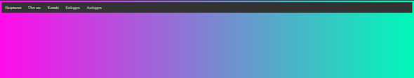
<div class="topnav" id="myTopnav">

<a href="#home" class="active">Home</a>

<a href="#news">News</a>

<a href="#contact">Contact</a>

<a href="#about">About</a>

<a href="javascript:void(0);" class="icon" onclick="myFunction()">

<i class="fa fa-bars"></i>

</a>

</div>

<div id="produkte">

<div class="produkt" id="schuh"><a href="#schuh"><center><img src="bilder/schuh.jpg" alt="Schuh"></center></a></div>

<div class="desc"><a>Nike Air</a></div><p>Toller Schuh mit dicker Sohle und guter Federung, wird meistens als Lauf- bzw. Freizeitschuh verwendet.</p>

<div class="produkt" id="schuh"><a href="#schuh"><center><img src="bilder/schuh.jpg" alt="Schuh"></center></a></div>

<div class="produkt" id="schuh"><a href="#schuh"><center><img src="bilder/schuh.jpg" alt="Schuh"></center></a></div>

</div>

</body>

</html>

Computer, HTML, programmieren, CSS

HTML Email Style wird nicht richtig gerendert?

Folgender Code:

<html>
    <body>
        <div style="font-family: arial;">
            <h1 style="color: #007bff; letter-spacing: 2px; font-weight: 500;">Neue Nachicht von der Website!</h1>
            <div>
                <h2 style="margin-top: 2rem; margin-bottom: .5rem; letter-spacing: 2px; font-weight: 500;">Kontaktdaten</h2>
                <div style="margin-right: 70px; display: inline-block;">
                    <p style="margin: .6rem 0;">Vorname:</p>
                    <p style="margin: .6rem 0;">Nachanme:</p>
                    <p style="margin: .6rem 0;">Email Adresse:</p>
                    <p style="margin: .6rem 0;">Telefonnummer:</p>
                </div>
                <div style="display: inline-block;">
                    <p style="margin: .6rem 0;">${ firstname }</p>
                    <p style="margin: .6rem 0;">${ lastname }</p>
                    <p style="margin: .6rem 0;"><a style="color: #007bff; text-decoration: none;" href="mailto:${ email }">${ email }</a></p>
                    <p style="margin: .6rem 0;">${ htmlPhone }</a></p>
                </div>
            </div>
            <div>
                <h2 style="margin-top: 3rem; margin-bottom: 1rem; letter-spacing: 2px; font-weight: 500;">${ subject }</h2>
                <div style="font-size: 17px; padding-right: 11%; max-width: 900px;">${ message }</div>
            </div>
        </div>
    </body>
</html>

Eigentlich sollten bei den Kontaktdaten 2 Divs nebeneinander sein. Funktioniert auch wenn ich die Email über gmail.com aufrufe. Aber nicht in Windows Mail etc. Woran liegt das?

Computer, HTML, Style, programmieren, CSS, E-Mail-Adresse, node.js

Meistgelesene Beiträge zum Thema CSS