wie in Bootstrap 5 vertikal zentrieren?
Der Container ist ganz oben was auch immer man probiert
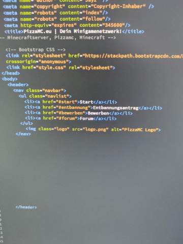
<div class="container mx-auto">
        <div class="row">
            <div class="col-sm-3"></div>
            <div class="col-sm-6">
                <div class="card">
                    <div class="card-header">Header</div>
                    <div class="card-body">Content</div>
                    <div class="card-footer">Footer</div>
                </div>
            </div>
        <div class="col-sm-3"></div>
    </div>
Computer,
Technik,
HTML,
IT,
Webseite,
programmieren,
CSS,
WordPress,
JavaScript,
PHP,
Webdesign,
Webentwicklung,
onlineshopsystem,
JSON,
Bootstrap