HTML - div verschwinden lassen nach Zeit?
Hallo,
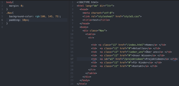
ich habe eine einfache Webanwendung mit HTML, CSS und JavaScript programmiert. Mit CSS habe ich eine einfache Lade-Animation erstellt.
Diese Animation ist in einem .div -Container gespeichert.
Diese Animation soll nach 5 Sekunden automatisch verschwinden, da der Content meiner Webanwendung bis dahin richtig geladen hat und sonst der Bildschirm mit den verschiedenen Elementen überflutet wäre...
Durch Google bin ich leider nicht schlauer geworden.
Kann mir jemand den Code als Antwort auf diese Frage geben oder einen Link zum Code geben?
Danke im Voraus!
Computer,
Technik,
HTML,
Webseite,
programmieren,
CSS,
JavaScript,
Technologie