Wie bekomme ich es hin, das die Kästen beim verkleinern des Fensters über die gesamte Länge geht?

Ich habe bisher das:

und verkleinert sieht es so aus:

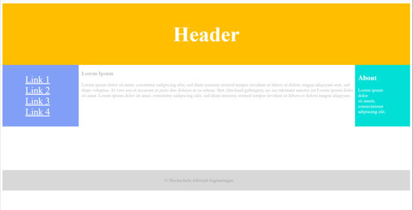
Aussehen soll es aber so:

Hier mein Code:

<!DOCTYPE html>
<html>
   <head>
      <title></title>
      <meta name="viewport" content="width=device-width, initial-scale=1.0, maximum-scale=1.0">
      <style>
         header {
         text-align: center;
         font-size: 3em;
         padding: 5px;
         color: #fff;
         background-color: #FFBF00;
         }
         .wrapper { display:flex }
         @media screen and (max-width:620px) {
         .wrapper {display:block }
         }
         nav {
         width:15%;
         text-align: center;
         font-size: 2em;
         padding-right: 60px;
         color: #fff;
         background-color: #819FF7;
         margin-right: 10px;
         margin-bottom: 150px;
         }
         a {color: #fff }
         li {list-style: none }
         article {
         width:70%;
         color: #BDBDBD;
         }
         aside {
         color: #fff;
         width: 15%
         text-align: center;
         font-size: 1em;
         padding: 10px;
         padding-right: 60px;
         background-color: #01DFD7;
         margin-bottom: 150px;
         }
         footer {
         text-align: center;
         font-size: 1em;
         padding: 10px;
         padding-right: 60px;
         background-color: #D8D8D8;
         color: #A4A4A4;
         }
      </style>
   </head>
   <body>
      <header><h2>Header</h2></header>
      <div class="wrapper">
           <nav>
            <ul>
               <li><a href="" target="_blank">Link 1</a></li>
               <li><a href="" target="_blank">Link 2</a></li>
               <li><a href="" target="_blank">Link 3</a></li>
               <li><a href="" target="_blank">Link 4</a></li>
            </ul>
         </nav>
         <article>
            <h3>Lorem Ipsum</h3>
               <p>Lorem ipsum dolor sit amet, consetetur sadipscing elitr,
               sed diam nonumy eirmod tempor invidunt ut labore et dolore
               magna aliquyam erat, sed diam voluptua. At vero eos et
               accusam et justo duo dolores et ea rebum. Stet clita kasd
               gubergren, no sea takimata sanctus est Lorem ipsum dolor sit
               amet. Lorem ipsum dolor sit amet, consetetur sadipscing elitr,
               sed diam nonumy eirmod tempor invidunt ut labore et dolore
            magna aliquyam.</p>
         </article>
         <aside>
            <h2>About</h2>
            <p>Lorem ipsum dolor<br>
               sit ametr,<br>
               consecteteuer<br>
               adipiscing elit.
            </p>
         </aside>
      </div>
      <footer>
         <p>&copy; </p>
      </footer>
   </body>
</html>
Bild zum Beitrag
HTML, CSS, HTML5

Wie kann ich mit css die zwei div container untereinander mit Abstand dazwischen anzeigen lassen?

<!DOCTYPE html>
<html>
   <head>
      <title></title>
      <style>
         .haupt {
         margint top: 50px;
         }
         .b1 {
         float: left;
         width: 400px;
         padding: 20px 0;
         color: #01DF01;
         border-bottom-width: 3px;
         border-style: solid;
         width: 50;
         height: 30;
         background-color: #fff;
         }
         .b2 {
         float: both;
         width: 400px;
         padding: 20px 0;
         color: #01DF01;
         border-bottom-width: 3px;
         border-style: solid;
         width: 50;
         height: 30;
         background-color: #fff;
         }
      </style>
   </head>
   <body>
      <div class="haupt">
         <div class="b1">
            Lorem ipsum dolor sit amet, consetetur sadipscing elitr,<br>
            sed diam nonumy eirmod tempor invidunt ut labore et<br>
            dolore magna aliquyam erat, sed diam voluptua.<br>
            At vero eos et accusam et justo duo dolores et
         </div>
         <div class="b2">
            Lorem ipsum dolor sit amet, consetetur sadipscing elitr,<br>
            sed diam nonumy eirmod tempor invidunt ut labore et<br>
            dolore magna aliquyam erat, sed diam voluptua.<br>
            At vero eos et accusam et justo duo dolores et
         </div>
      </div>
   </body>
</html>                  
HTML, CSS
Weitere Inhalte können nur Nutzer sehen, die bei uns eingeloggt sind.