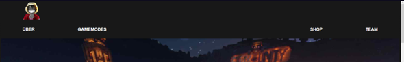
navbar logo in die mitte?
Bin gerade dabei Für einen Freund eine Website zu erstellen jedoch ist es das erste mal das ich ein logo in die Mitte machen muss und ich komm mit nichts weiter.. Tutorials.. w3schools.. etc
html
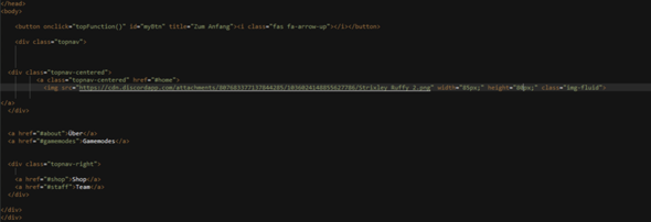
	<div class="topnav">


  <div class="topnav-centered">
		  <a class="topnav-centered" href="#home">
            <img src="https://cdn.discordapp.com/attachments/807683377137844285/1036024148855627786/Strixley_Ruffy_2.png" width="85px;"	height="80px;" class="img-fluid">

</a>
  </div>


  <a href="#about">Über</a>
  <a href="#gamemodes">Gamemodes</a>


  <div class="topnav-right">

    <a href="#shop">Shop</a>
    <a href="#staff">Team</a>
  </div>


</div>
</div>
css
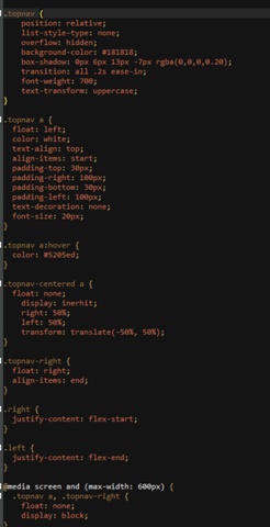
.topnav {
	position: relative;
	list-style-type: none;
    overflow: hidden;
    background-color: #181818;
    box-shadow: 0px 6px 13px -7px rgba(0,0,0,0.20);
    transition: all .2s ease-in;
    font-weight: 700;
    text-transform: uppercase;
}


.topnav a {
  float: left;
  color: white;
  text-align: top;
  align-items: start;
  padding-top: 30px;
  padding-right: 100px;
  padding-bottom: 30px;
  padding-left: 100px;
  text-decoration: none;
  font-size: 20px;
}


.topnav a:hover {
  color: #5205ed;
}


.topnav-centered a {
  float: none;
    display: inerhit;
    right: 50%;
    left: 50%;
    transform: translate(-50%, 50%);
}


.topnav-right {
  float: right;
  align-items: end;
}


.right {
  justify-content: flex-start;
}


.left {
  justify-content: flex-end;
}


@media screen and (max-width: 600px) {
  .topnav a, .topnav-right {
    float: none;
    display: block;
}
	.topnav-centered a {
    position: relative;
    top: 0;
    left: 0;
    transform: none;
	}
}


@media screen and (max-width: 800px) {
  .topnav a:not(:first-child) {display: none;}
  .topnav a.icon {
    float: right;
    display: block;
  }
}


@media screen and (max-width: 800px) {
  .topnav.responsive {position: relative;}
  .topnav.responsive .icon {
    position: center;
    right: 0;
    top: 0;
  }
  .topnav.responsive a {
    float: right;
    display: inline-block;
    text-align: left;
  }
}


@media screen and (min-width: 800px) {
  div .max-width {
    max-width: 60%;
    margin: 0 auto;
    box-shadow: none;
  }
}


	.topnav-centered a {
    position: relative;
    top: 0;
    left: 0;
    transform: none;
	}


body {
  padding: 0px;
  background-image: linear-gradient(rgba(24, 24, 24, 1), rgba(14, 14, 14, 1));
  color: black;
  font-size: 20px;
}
1 Antwort
In der Desktopansicht überschreibst du die CSS-Properties top, left und transform für den .topnav-centered a-Selektor. Nimm die raus, korrigiere den display-Wert (inherit) und ergänze eine Zentrierung des Bildes via
text-align: center;
Ich persönlich würde allerdings eine andere Methodik zur Zentrierung nutzen. Hier findest du einen Guide.
Und da du schon bei Korrekturen bist:
Die Werte der Attribute height und width von deinem img-Tag sind falsch. Es dürfen nur numerische Werte sein.
<img height="80" width="85" ...>
Des Weiteren fehlt ein alt-Attribut, welches in diesem Fall die Funktion der Linkbeschriftung übernehmen würde. Diese sollte also genau ausdrücken, was der Link tut (z.B. Gehe zu Startseite).
Deine Box mit dem Logo sollte demzufolge so aussehen:
<div class="logo-container">
  <a href="#home">
    <!-- image -->
  </a>
</div>
Die Klasse logo-container habe ich hinzugefügt.
CSS:
.logo-container {
  display: flex;
  justify-content: center;
}
Da die Flexbox horizontal ausgerichtet ist, würde align-items sich auf die Ausrichtung auf der vertikalen Achse auswirken.
Ich danke dir :D warst mir eine große hilfe bin noch nicht so krass lange dabei was websiten coden angeht ^^
Hey,
Tatsächlich bin ich nach ein paar websiten und tutorials auch auf die methode gekommen die du mir hier Vorgeschlagen hast, allerdings bin ich irgendwie zu inkompetent es in die Mitte zu kriegen hab das mit dem .topnav-centered a gelöscht und benutze jetzt display: flex; und um das bild in die mitte zu bekommen align-items: center; denoch will des blöde bild nicht in die mitte.. finde ich fragwürdig. Mache ich was falsch?